This article was originally published September 26, 2023.
It was 3:14 pm on the east coast and I was minding my business (scrolling social media, looking into other people’s business) when I was devastatingly and brutally assaulted by one of the most disorienting graphics I’ve seen in some time, courtesy of Fox Sports.
The Wild, Wild AL West
pic.twitter.com/pINxY6m56E
— FOX Sports: MLB (@MLBONFOX) September 25, 2023
At first glance you might not think there’s anything wrong with this. On second glance you might have a couple questions. On third glance the door closes behind you. You try the handle but it’s locked. You look up and the light flickers out. They’ve got you now.
Let’s break this down by section, in an attempt to get a better handle on what’s going on or possibly recreate The Yellow Wallpaper.
The Header

Alright. Straightforward enough. Now we know what we’re in for: a backward-looking view at the contenders in the AL West and how their performances this weekend impacted their divisional and Wild Card positions.
The Teams
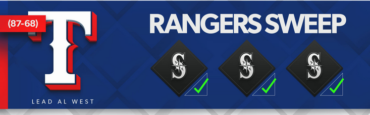
Okay, it’s our first team and an introduction to the format. We’re laying some ground rules here. Record in a little banner on the top left, edging out over the team in question’s logo. Sure, maybe a little busy but that’s fine. Some fine print underneath detailing where they sit in the division.
Then we get a text + graphic combo on the right-hand side, recapping the Rangers’ (the team in question) performance: “Rangers Sweep” plus three separate Mariners logos inside one of those infield diamonds they use when a runner is on base. On the bottom right of each diamond there is a green check mark residing in a triangle.
This display clearly indicates that the left-side logo is the team we’re talking about, the logos in the bases are their opponent, and the check marks indicate a successful defeat of that opponent for the team in question. I believe these are the takeaways that any reasonable person would have from interpreting the Rangers section of this graphic. Let’s move on to Houston.
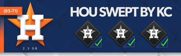
Alright, let’s start on the left again. Record in the team-color banner edging out over the logo? Yup, got it. Little detailed text below the logo indicating position within the divisional race? You bet. Okay, now let’s allow our eyes to wander over to the right-hand portion of the graphic and
God dammit! What the hell is this!? The text reads “HOU Swept by KC” which is all well and good (well, not for the Astros), but then the logos in the bases are Astros logos, and the check marks are still there like in the Rangers one versus Seattle. But by the rules set forth in the prior section that would mean… the Astros… defeated… the Astros?
Okay, I’m sure Houston fans could actually come around to that point of view but then it also clearly says that KC swept Houston right above it! In what may come to be a mistake, I’m deeply doubting that the graphics department at Fox Sports is making some sort of argument about how the Astros shot themselves in the… foot this weekend, rather than, well, attempting to simply report some results.
Okay, so to reset, we know that the team whose logo is inside the bases graphic with the checkmark next to them lost this past weekend. We no longer can confidently claim that the team who this section of the graphic is about is the one that defeated them, nor that the two teams in question were even opponents.
Okay, time for team number three.
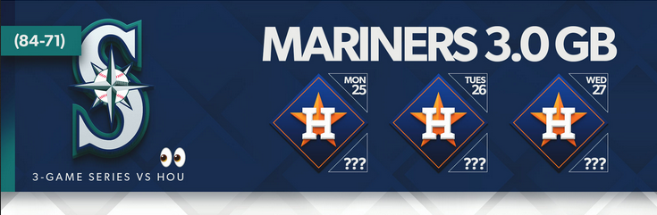
Okay, again some consistency on the left side here: Banner with the current record overlapping with the Mariners logo, and… what’s this? The detailed text below isn’t about the past weekend like the other two sections. It reads: 3-game series vs HOU. And… there is an eyes emoji sitting above “HOU.” This, unlike the other sections, does not detail the Mariners position within the divisional standings.
No, why would it, despite that being one of the only clearly defined throughlines connecting the prior two sections? Instead, they’ve moved the Mariners’ divisional standing to the text portion above the bases. The bases now are filled with Astros logos even though the Mariners played the Rangers last weekend (as defined in the top section) and guess we suddenly have DATES IN TRIANGLES ON THE TOP RIGHT OF EACH BASE. THAT’S RIGHT, WE’VE JUST TAKEN THIS RECAP INTO THE FUTURE.
Oh yeah, and the bottom right of each base, where the green check marks had lived are now three question marks. I don’t know. I guess they don’t either.
It seems pretty clear they could have just swapped the “Mariners 3.0 GB” and “3-game series vs. HOU” text to at least keep one through-line in there, and that text above the Astros logos with the dates would be a little more thematically consistent, at least within this one box but what do I know.
Nothing. The answer is nothing. I’ve stared into the graphic for far too long. It’s got its claws in me and it won’t let go. I’ve lost all prior knowledge and since it is so baffling I have no current knowledge. The only thing I’m fairly certain of is that the eyes emoji is the graphic staring back at me.
The post Best of BP: I Had to See This Infographic and Now You Do Too appeared first on Baseball Prospectus.
